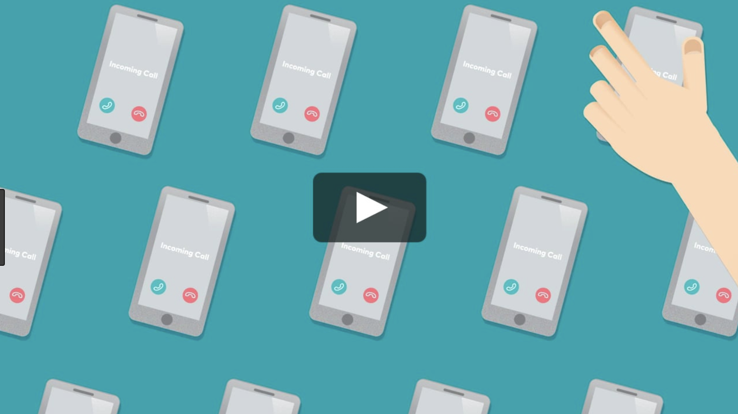
Optus Loop is a B2B cloud/VoIP phone system that allows users to pick up calls to their business number in the office or on the move, via desk phone, mobile or PC. As the current product page was not performing well in generating online leads, the business has decided to investigate and revamp the UX.
As a UX lead, the first step I took for this project was coming up with with a purpose or business goal that was agreed by all stakeholders.
“How might we improve the online experience for Loop so that it looks more relevant to customer needs and appealing as a product?”
This was translated into following hypothesis:
We believe that customers want more transparency and clarity around our product Loop.
So if we explain the product more clearly, disclose more details on features and information on the set up process,
We will see an increase in the online lead generation.
I had multiple roles for this project - research and analysis, UX and UI design, running stakeholder review sessions, coordination of content production and delivery of assets.
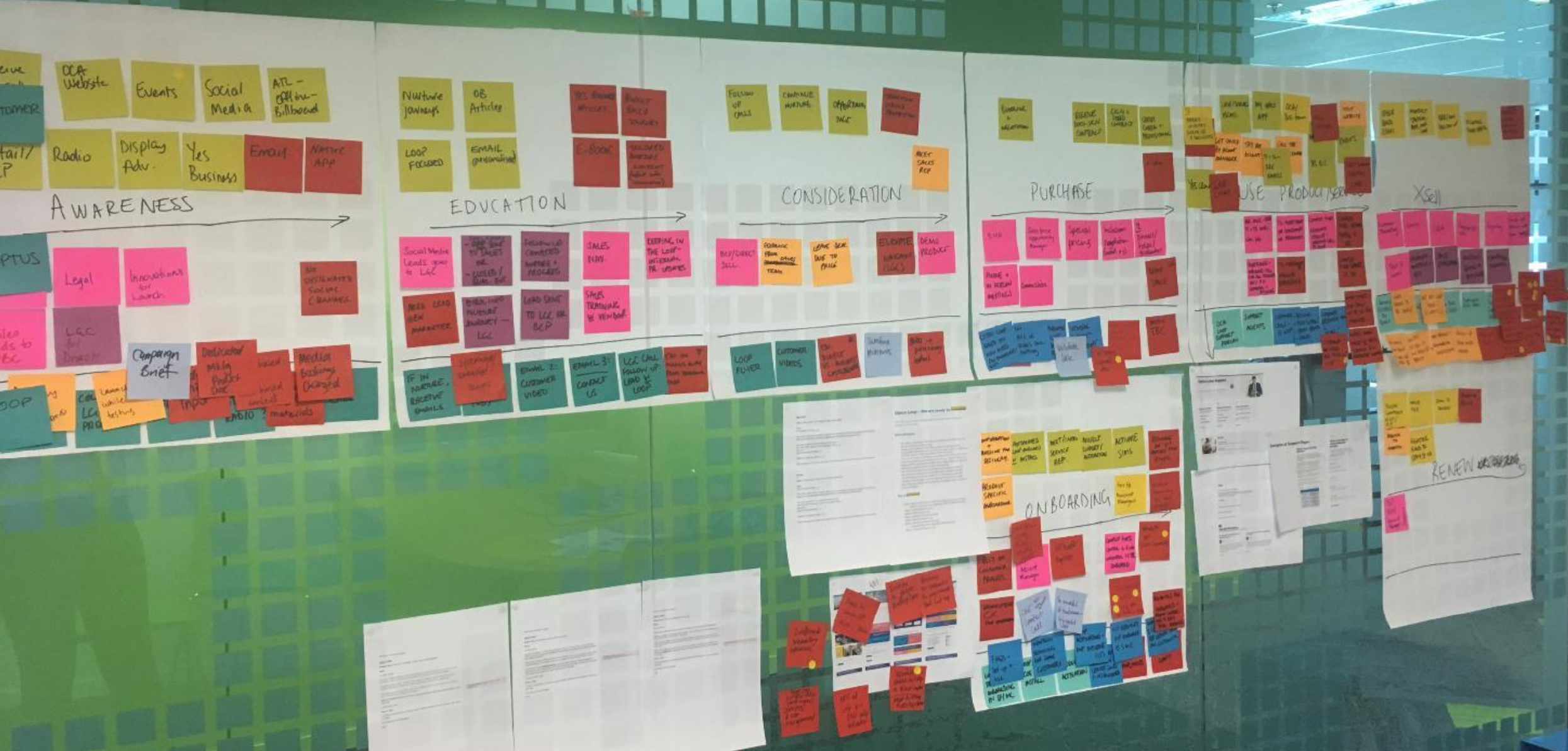
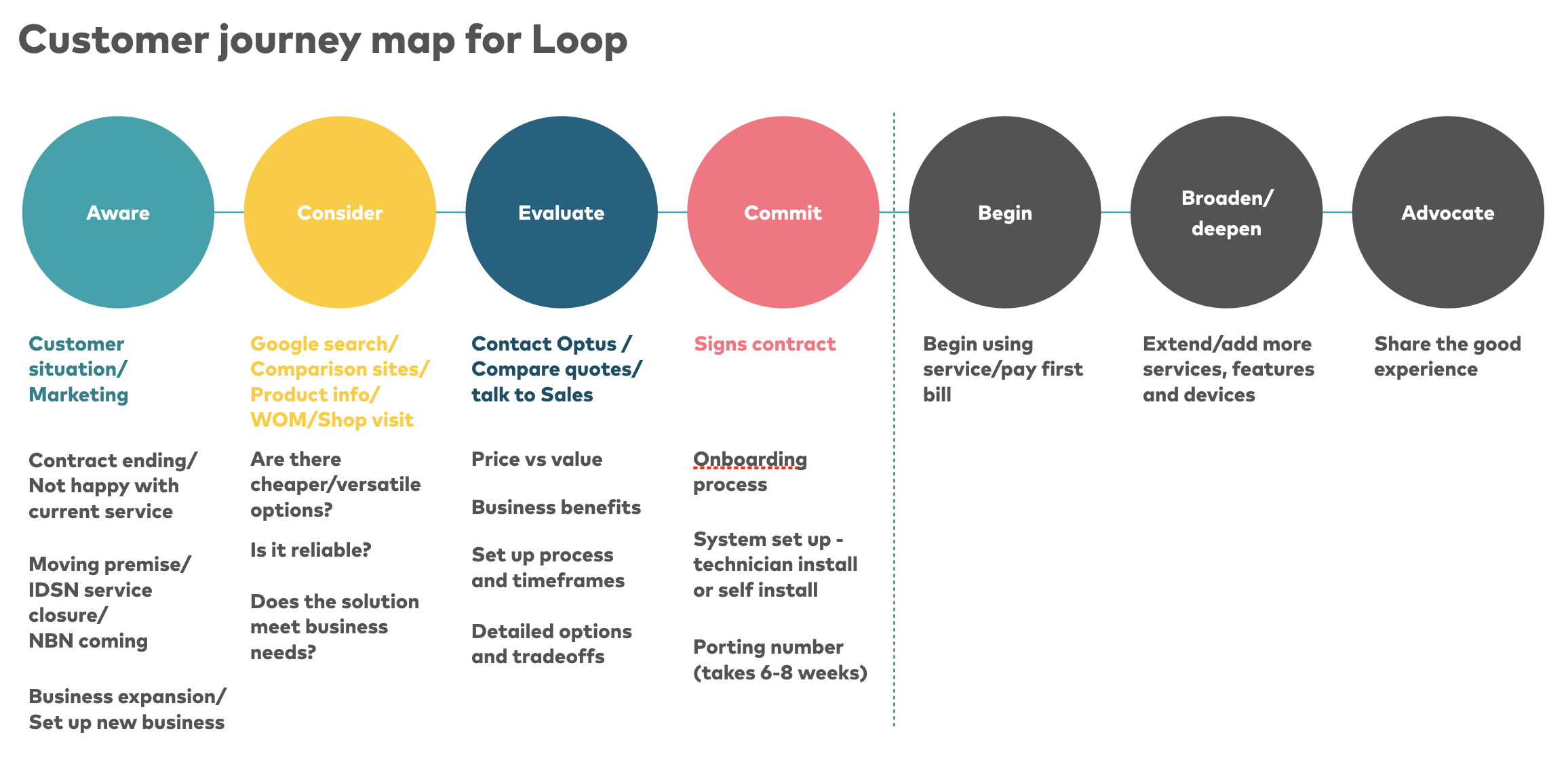
I started on the initial research by looking at analytics on the web, on page survey and conducting usability testings/customer interviews. Several workshops involving key stakeholders (Product and Sales) were also set up so the team could understand the business process and the customer journey for the product purchase.
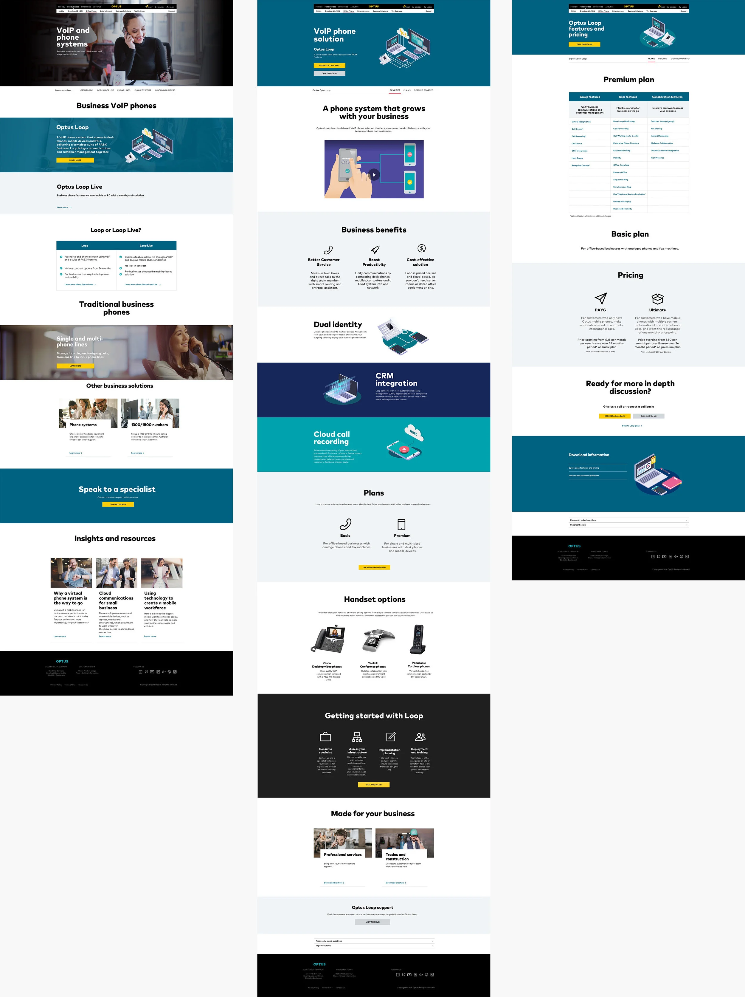
From the testing it was clear that all participants wanted more transparencies around product plans, features, pricing and technical specs, and even though they were expected to be the ‘experts’, some did not understand what was considered to be simple jargons, and it was obvious that a new content strategy should be formulated so that we can address wider audience.
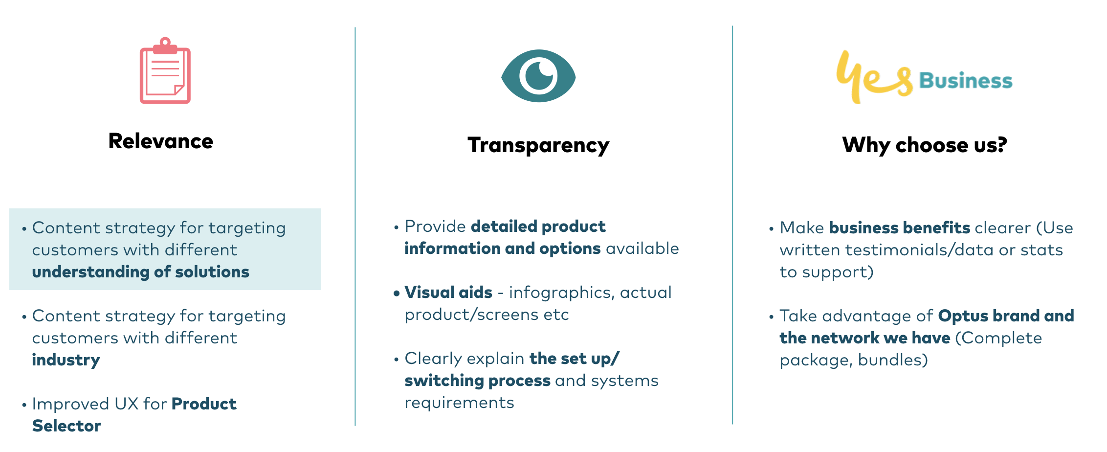
Based on the analytics, survey and customer interviews, I came up with 3 customer value proposition: Relevance, Transparency and Why choose us.
To make the content more relevant to customers we decided to use content strategies targeting different segments based on customer’s level of understanding in technology:
1. For customers who are not aware the type of solution is available, we will:
*Make use of other product space on the corporate website to attract potential customers, e.g. business mobile plans, broadband, other B2B products
* Overall, use simple and pragmatic language, and include keywords that are more familiar and well received in heading 1 copy - e.g. VoIP
2. For customers who are aware the type of solution is available but not familiar with terms & technology, we will:
* Clearly illustrate key functions and features, plans and pricing
* Make business benefits obvious by using visual aids
3. For expert customers who are familiar with terms and current technology available,
* Provide downloadable materials with detail info (data sheet, hardware and system requirements, switching process etc)
With these UX principles in mind, I worked closely with the copywriter and the Product team to bring relevant content to customers ensuring customer friendly language is used. A new prototype was mocked up and it was validated with another 5 new participants where some more improvements were made mainly on the product detail copy. After getting approval from Legal we are currently in the build stage, and we will be able to measure the success metric by the number of increase in the lead generation form submission, as well as from the direct comparison of the on-page Medallia survey feedback from the previous design with the new design.